The Nike logo isn’t just a symbol—it’s a global icon that speaks speed, ambition, and victory without saying a word. From sneakers to sportswear, this simple design has shaped how millions perceive athletic excellence. You’ve seen it everywhere, yet its story runs deeper than most people realise.
Created with simplicity in mind, the Nike logo became one of the most recognisable marks in branding history. It blends motion, identity, and emotion into a single stroke. In this article, you’ll explore its meaning, evolution, design secrets, and why it continues to dominate the global market—even decades after its creation.
The History of the Nike Logo
The journey of the Nike logo started in 1971, when a young design student created a symbol that would later define a billion-dollar brand. At that time, Nike was still a growing company trying to establish its identity in the competitive sports market.
The original logo featured the iconic swoosh alongside the brand name in bold lettering. Over time, the company simplified the design, eventually removing the text entirely. Today, the swoosh alone represents the brand globally, proving how powerful minimalism can be in branding.
Meaning Behind the Nike Logo
The Nike logo carries a deeper meaning rooted in movement and victory. The swoosh symbolises speed, motion, and the wing of Nike, after whom the company is named.
This connection gives the logo a psychological edge. It subtly communicates winning, achievement, and forward momentum. That’s why athletes and consumers associate it with success—it taps into a universal desire to push limits and achieve greatness.
Evolution of the Nike Logo Design
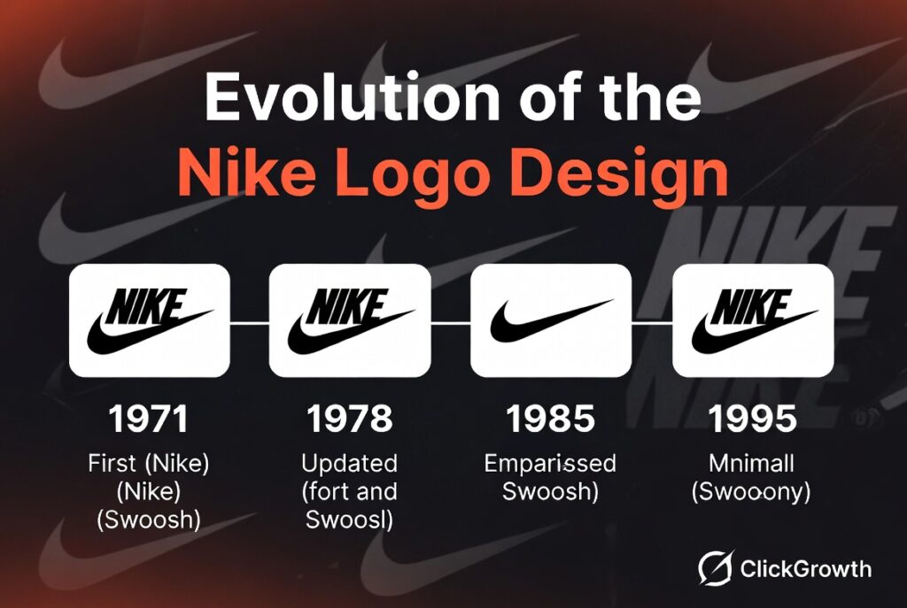
| Year | Design Change | Key Feature |
|---|---|---|
| 1971 | First Logo | Swoosh + Nike text |
| 1978 | Font Update | Cleaner, bold typography |
| 1985 | Swoosh Emphasis | Bigger swoosh focus |
| 1995 | Minimal Logo | Swoosh only |
The Nike logo evolved through simplification. Instead of adding complexity, the brand removed elements over time. This approach made the logo more memorable and versatile across different platforms and products.
Today’s version proves that less truly is more. The clean swoosh works perfectly on shoes, clothing, ads, and digital platforms without losing its identity.
Who Designed the Nike Logo?
The famous swoosh was designed by Carolyn Davidson, a student at Portland State University. She was paid only $35 for her work, which later became one of the most valuable logos in the world.
Interestingly, years later, Nike rewarded her with stocks and recognition. Her story shows how simple ideas—when executed well—can create massive long-term value. It also highlights the importance of vision in branding decisions.
Why the Nike Logo Is So Successful
Key Reasons Behind Its Success:
- Simple design that’s easy to recognize
- Timeless appeal across generations
- Strong emotional connection with athletes
- Versatility across all media formats
The Nike logo succeeds because it communicates instantly. You don’t need text or explanation. One glance triggers brand recognition, trust, and aspiration. That’s the ultimate goal of any logo—and Nike mastered it.
Design Elements of the Nike Logo
1. Shape
The swoosh represents motion and speed. Its curved design creates a sense of forward movement, making it perfect for a sports brand.
2. Color
Nike often uses black or white for its logo. These neutral colours make the design adaptable and bold in any setting.
3. Typography (Past Use)
Earlier versions used strong, uppercase fonts to reinforce authority and confidence. Eventually, the logo evolved beyond needing text.
Nike Logo vs Other Brand Logos
| Brand | Logo Style | Key Feature |
|---|---|---|
| Nike | Minimal | Motion-based swoosh |
| Adidas | Geometric | Three stripes |
| Puma | Symbolic | Jumping animal |
Compared to competitors, the Nike logo stands out for its simplicity. While others rely on shapes or mascots, Nike uses motion as its identity, making it more dynamic and emotionally engaging.
Psychological Impact of the Nike Logo
The Nike logo triggers powerful emotions tied to success and performance. When people see it, they often associate it with professional athletes, discipline, and achievement.
This psychological connection influences buying decisions. Consumers don’t just purchase products—they buy into a mindset. Nike successfully positioned its logo as a symbol of determination and victory.
How the Nike Logo Boosts Brand Identity
Branding Advantages:
- Builds instant recognition worldwide
- Creates trust among customers
- Enhances product value perception
- Supports strong marketing campaigns
The Nike logo acts as a silent ambassador. It speaks for the brand even when no words are present. This makes it incredibly powerful in advertising and product design.
Lessons Businesses Can Learn from the Nike Logo
Key Takeaways:
- Keep your design simple and memorable
- Focus on emotional connection
- Ensure scalability across platforms
- Build consistency over time
The success of the Nike logo proves that a great logo isn’t about complexity—it’s about clarity and meaning. Businesses can apply these principles to create strong brand identities.
Fun Facts About the Nike Logo
- The swoosh cost only $35 initially
- It represents the wing of a Greek goddess
- The logo is recognized in almost every country
- Nike dropped the text in 1995
These facts highlight how a small design decision turned into a global phenomenon.
The Hidden Strategy Behind the Nike Logo’s Global Popularity
The Nike logo didn’t become famous by accident—it grew through smart, long-term strategy. From athlete endorsements to powerful storytelling campaigns, the swoosh consistently appeared alongside moments of victory. This repetition built deep trust and familiarity across audiences in the USA and beyond.
Strategic Factors That Boosted Popularity:
- Partnerships with athletes like Michael Jordan
- Iconic campaigns like “Just Do It”
- Strong presence in global sports events
- Consistent visual branding across all platforms
These strategies turned the Nike logo into more than a symbol—it became a lifestyle statement.
How the Nike Logo Performs in Digital Marketing
In today’s online world, the Nike logo thrives across websites, social media, and ads. Its simple design ensures it looks sharp on mobile screens, apps, and even small icons. That’s a huge advantage in a fast-scrolling digital environment.
| Platform | Logo Impact | Benefit |
|---|---|---|
| High visibility | Instant recognition | |
| Websites | Clean design | Better UX |
| Ads | Eye-catching | Higher engagement |
Because the logo is minimal, it loads quickly and adapts easily. This helps brands maintain speed and performance—two key factors in SEO and user experience.
Future Trends: Will the Nike Logo Ever Change?
The Nike logo has reached a level where major changes are unlikely. However, brands constantly adapt to modern trends, so subtle updates in colour, animation, or usage could appear in the future.
Experts believe Nike will keep the swoosh but experiment with digital enhancements like motion graphics or interactive branding. Still, the core identity will remain untouched, as it already holds massive recognition and emotional value.
This shows a key lesson: once a logo achieves perfection, evolution becomes about refinement—not reinvention.
Conclusion
The Nike logo stands as one of the most powerful branding symbols in history. Its simple swoosh carries meaning, emotion, and identity that connects with millions worldwide. From its humble beginnings to global dominance, the logo reflects innovation and vision.
What makes it truly special is its ability to communicate without words. It inspires action, confidence, and ambition. Whether you’re an entrepreneur or a designer, the Nike logo offers timeless lessons in branding, simplicity, and emotional impact that can shape your own success journey.
FAQs
1. What does the Nike logo represent?
It symbolises motion, speed, and victory, inspired by the Greek goddess Nike.
2. Who created the Nike logo?
It was designed by Carolyn Davidson in 1971.
3. Why is the Nike logo so famous?
Its simplicity, emotional appeal, and strong branding make it globally recognisable.
4. Has the Nike logo changed over time?
Yes, it evolved from text + swoosh to a simple standalone swoosh.
5. How much did Nike pay for the logo?
Initially, only $35, though the designer was later rewarded generously.