The Microsoft Logo stands as one of the most recognizable symbols in the global tech industry. From its humble beginnings in the 1970s to its modern minimalist design, the logo reflects innovation, adaptability, and brand strength. Whether you’re a designer, marketer, or curious reader, understanding this logo gives you insight into how powerful branding works.
Over the decades, Microsoft has transformed its identity multiple times, aligning its logo with changing technology trends and user expectations. Each version tells a story—of growth, ambition, and global dominance. In this detailed guide, you’ll explore the evolution, hidden meaning, design elements, and reasons behind the logo’s lasting success in the USA and worldwide markets.
History of the Microsoft Logo
The journey of the Microsoft Logo began in 1975 when the company was founded by Bill Gates and Paul Allen. The early designs reflected the era’s trends but lacked the simplicity we see today.
Initially, the logo featured a retro-style typography inspired by disco culture. As the company grew, it shifted towards more professional and corporate looks to appeal to a wider audience, especially in the competitive USA market.
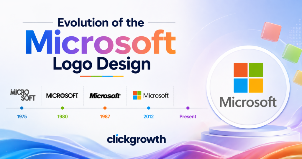
Timeline of Logo Changes
| Year | Logo Style | Key Features |
|---|---|---|
| 1975 | Retro | Disco-style typography |
| 1980 | Sharp | Angular lettering |
| 1987 | Classic | “Pac-Man” cut in “O” |
| 2012 | Modern | Four-color square icon |
Each transformation helped the Microsoft Logo stay relevant while maintaining brand recognition.
Evolution of the Microsoft Logo Design
The evolution of the Microsoft Logo mirrors the growth of the tech industry itself. In 1987, the company introduced the iconic “Pac-Man” logo, which became a defining identity for decades.
Later in 2012, Microsoft introduced a bold redesign featuring a four-colored square symbol alongside clean typography. This modern look aligned with products like Windows and Microsoft Office, emphasizing unity across its ecosystem.
Key Changes Over Time
- Shift from complex to minimalist design
- Introduction of color symbolism
- Alignment with digital product branding
This evolution made the Microsoft Logo more versatile across devices, from desktops to mobile apps.
Meaning Behind the Microsoft Logo
The modern Microsoft Logo is more than just a visual identity—it carries deep meaning. The four colored squares represent the company’s diverse product range and innovation-driven culture.
Each color symbolizes a different aspect:
- Red – Energy and passion
- Green – Growth and innovation
- Blue – Trust and reliability
- Yellow – Creativity and optimism
Together, they form a window-like design, reflecting the core concept behind Microsoft Windows.
Symbolism Breakdown
- Window shape → Technology and accessibility
- Colors → Product diversity
- Typography → Simplicity and clarity
This thoughtful design makes the Microsoft Logo meaningful and instantly recognizable.
Design Elements of the Microsoft Logo
The success of the Microsoft Logo lies in its clean and strategic design elements. Every detail is carefully crafted to ensure clarity across platforms.
Core Design Features
- Typography: Modern, sans-serif font
- Icon: Four-square grid
- Color palette: Bright and balanced
- Spacing: Clean and minimal
Why It Works
- Easy to scale on all devices
- Recognizable even at small sizes
- Works across digital and print media
These elements ensure the Microsoft Logo remains effective in branding, especially in competitive markets like the USA.
Why the Microsoft Logo Is So Successful
The Microsoft Logo succeeds because it combines simplicity with strong brand identity. Unlike overly complex logos, it communicates instantly and clearly.
One major factor is consistency. Microsoft uses the same visual identity across all its products, including Microsoft Teams and Xbox.
Success Factors
- Minimalist design
- Strong color psychology
- Consistent branding
- Global recognition
This makes the Microsoft Logo a perfect example of modern branding excellence.
Microsoft Logo vs Competitors
In the tech industry, logos play a huge role in brand positioning. The Microsoft Logo competes with other giants like Apple Inc. and Google.
Comparison Table
| Company | Logo Style | Approach |
|---|---|---|
| Microsoft | Colorful grid | Product diversity |
| Apple | Minimal icon | Premium simplicity |
| Colorful text | Playful innovation |
Microsoft stands out by combining color and structure, giving it a balanced identity.
Interesting Facts About the Microsoft Logo
The Microsoft Logo has several fascinating details that many people don’t notice.
Did You Know?
- The “Pac-Man” logo lasted over 25 years
- The current logo was introduced in 2012
- It represents a unified brand across all products
- The design aligns with modern UI trends
These facts highlight how the Microsoft Logo evolved while maintaining its core identity.
How the Microsoft Logo Influences Branding
The Microsoft Logo has influenced modern branding strategies worldwide. Many companies now follow its approach of simplicity and scalability.
Its clean design works perfectly on apps, websites, and advertisements. This adaptability is crucial in today’s digital-first world, especially for businesses targeting the USA audience.
Branding Lessons
- Keep designs simple
- Use meaningful colors
- Maintain consistency
- Focus on scalability
These lessons make the Microsoft Logo a benchmark in design.
Microsoft Logo in Marketing Campaigns
The Microsoft Logo is a cornerstone of the company’s marketing strategy. It appears consistently in advertisements, sponsorships, and digital campaigns, reinforcing brand recognition. In the USA, this consistency helps consumers instantly associate products with trust, innovation, and reliability.
Marketing Integration Examples
- Featured in Windows OS launch campaigns
- Present in global tech events and expos
- Used across social media platforms for consistent branding
| Platform | Logo Usage | Impact |
|---|---|---|
| TV Ads | Full-screen logo | Increased recall |
| Social Media | App icons & posts | Boosts engagement |
| Billboards | Minimalist display | Instant recognition |
Microsoft Logo Across Products
One of the most effective aspects of the Microsoft Logo is its versatility across different products. From software to hardware, the logo creates a uniform identity that ties all offerings together. This approach strengthens brand loyalty, particularly in tech-savvy American markets.
Product Integration
- Windows – Logo adapts to software UI themes
- Microsoft Office – Icon matches suite colors
- Xbox – Minimalist use on hardware and packaging
- Surface Devices – Laser-etched logo for premium feel
Key Benefit: Consistent visual identity increases user trust and product recognition.
Future of the Microsoft Logo
As Microsoft expands into AI, cloud computing, and metaverse technologies, the Microsoft Logo may continue evolving while keeping its core design. The logo’s adaptability ensures it remains modern and relevant in a rapidly changing tech landscape.
Predicted Trends
- Slight refinements in typography for digital displays
- Color palette adjustments for AR/VR interfaces
- Integration with AI-powered branding tools
Insight: A flexible, minimalist logo ensures Microsoft stays ahead in innovation while keeping brand identity intact.
Conclusion
The Microsoft Logo is more than just a corporate symbol—it’s a story of innovation, growth, and strategic branding. From its retro beginnings to its modern minimalist design, it reflects how Microsoft has evolved into a global tech leader.
Its clean structure, meaningful colors, and consistent use make it one of the most successful logos in history. Whether you’re building a brand or studying design, the Microsoft Logo offers valuable insights into what makes a logo truly powerful. As technology continues to evolve, this iconic logo will likely remain a symbol of trust and innovation for years to come.
FAQs About Microsoft Logo
1. What does the Microsoft Logo represent?
It represents diversity, innovation, and the company’s wide range of products.
2. When was the current Microsoft Logo introduced?
The modern logo was launched in 2012.
3. Why does the Microsoft Logo have four colors?
Each color symbolizes different values like creativity, trust, and growth.
4. What was the “Pac-Man” Microsoft Logo?
It was the 1987 logo featuring a cut in the letter “O.”
5. Why is the Microsoft Logo so popular?
Because of its simplicity, strong branding, and global recognition.