The Snapchat Logo is more than just a playful ghost icon you see on your phone screen. It represents one of the most influential social media platforms of the modern digital era—Snapchat. Over the years, this simple yet powerful symbol has become a global identity marker for disappearing messages, creative filters, and fast-paced communication that defines Gen Z culture in the United States and beyond.
In this detailed guide, we will explore the Snapchat Logo, its origin story, design evolution, hidden symbolism, and branding psychology. You will also learn how it became a cultural icon and why it stands out among competitors in the crowded social media market. We will break down every aspect in a structured way, including tables, comparisons, and visual insights.
If you are researching branding, digital marketing, or simply curious about the Snapchat ghost, this article gives you everything in one place.
The Origin Story of Snapchat Logo
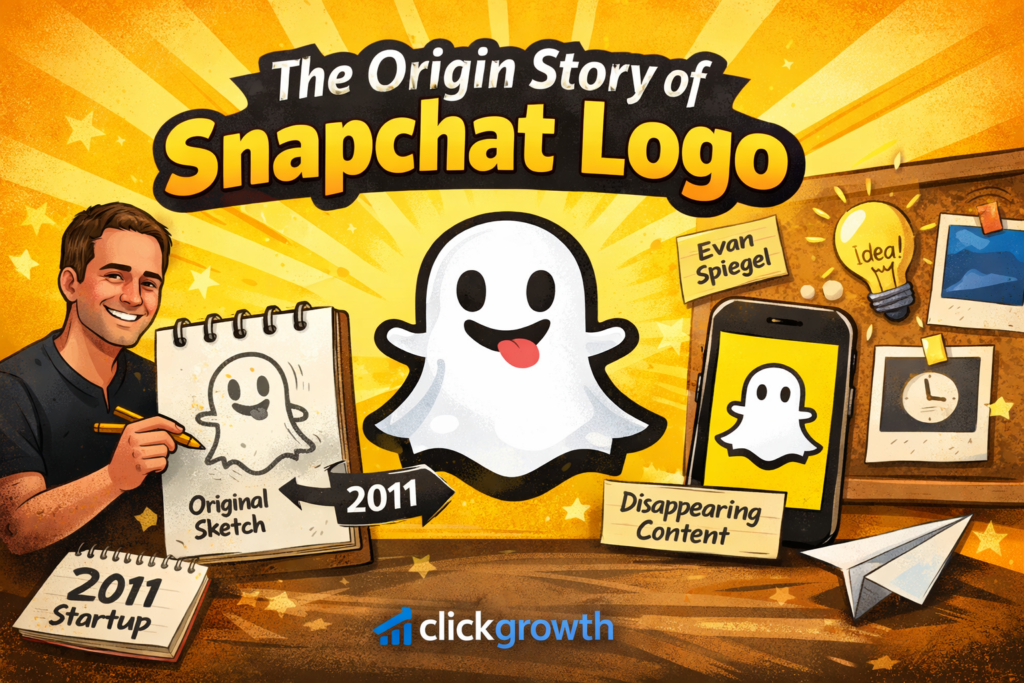
The Snapchat Logo started as a simple doodle idea, inspired by the concept of disappearing content. The founders wanted a symbol that reflected something temporary, fun, and slightly mysterious. That’s where the ghost came in—representing messages that vanish after being viewed.
The early design was created by Evan Spiegel during the app’s early development phase. It wasn’t polished at first, but it carried a strong identity. The ghost was chosen because it perfectly matched the app’s core idea: nothing stays forever.
Key Origin Highlights
| Feature | Description |
|---|---|
| Symbol | Ghost icon |
| Meaning | Ephemeral messaging |
| Creator | Evan Spiegel |
| Core Idea | Disappearing content |
The Snapchat Logo quickly became the face of the app, helping it stand out in a competitive social media landscape dominated by permanent content platforms.
Meaning Behind the Snapchat Ghost Logo
The Snapchat Logo is not just cute—it carries deep branding psychology. The ghost represents impermanence, secrecy, and playful communication. It visually communicates that users can share moments without fear of permanence.
The white ghost on a yellow background creates a strong emotional contrast. Yellow symbolizes happiness and energy, while white represents simplicity and clarity. Together, they create a youthful and energetic identity that appeals strongly to American teens and young adults.
Symbolism Breakdown
- 👻 Ghost = disappearing content
- 🟡 Yellow = happiness and creativity
- ⚪ White = simplicity and clarity
- 🎯 Overall message = “live in the moment”
This emotional design helped the Snapchat Logo become instantly recognizable across millions of devices worldwide.
Evolution of Snapchat Logo Over Time
The Snapchat Logo has gone through subtle but important refinements since its launch. While the ghost shape remained consistent, its detailing, thickness, and spacing were improved for better scalability.
Logo Evolution Table
| Year | Change Type | Description |
|---|---|---|
| 2011 | Original design | Rough ghost sketch |
| 2013 | Refinement | Cleaner edges |
| 2016 | Branding update | Bold outline added |
| 2019+ | Modern version | Minimal, scalable icon |
Each update ensured the logo remained clean on mobile screens, app stores, and marketing materials. Despite these changes, the core identity never changed, proving strong brand consistency.
Design Elements of Snapchat Logo
The Snapchat Logo uses minimal design principles, which is a major reason for its success. Simplicity ensures it is recognizable even at very small sizes.
Design Features
- Flat design style
- High contrast colors
- Minimal detailing
- Strong silhouette shape
- Scalable vector format
The ghost shape is intentionally irregular, giving it a hand-drawn feel. This makes the logo feel more human and less corporate, which resonates with younger audiences.
Design Impact Table
| Element | Effect |
|---|---|
| Minimalism | Easy recognition |
| Bright yellow | High visibility |
| Ghost shape | Emotional identity |
| Flat design | Modern appeal |
The Snapchat Logo proves that simplicity often beats complexity in digital branding.
Psychological Impact of Snapchat Logo
The Snapchat Logo works because it taps into human psychology. People are naturally drawn to bright colors and simple shapes, especially in fast-scrolling environments like mobile apps.
The ghost also triggers curiosity. It makes users wonder what the app does before even opening it. This curiosity-driven design played a huge role in Snapchat’s viral growth in the United States.
Psychological Triggers
- Curiosity (ghost symbolism)
- Urgency (disappearing content idea)
- Joy (yellow color tone)
- Simplicity (easy recognition)
These elements combine to create a strong emotional bond between users and the brand.
Snapchat Logo vs Other Social Media Logos
The Snapchat Logo stands out in a crowded market dominated by blue and neutral tones.
Comparison Table
| Platform | Logo Style | Color Theme |
|---|---|---|
| Snapchat | Ghost icon | Yellow/White |
| “f” symbol | Blue | |
| Camera icon | Gradient | |
| Twitter/X | Bird icon | Black/Blue |
Unlike competitors, Snapchat uses a playful identity instead of corporate seriousness. This makes it more appealing to younger audiences in the USA.
The Snapchat Logo successfully differentiates itself through emotional branding rather than formal design.
Branding Power of Snapchat Logo
The Snapchat Logo is a key driver of brand recognition. It appears everywhere—app stores, ads, merchandise, and social media promotions. Its simplicity makes it easy to reproduce across platforms.
Strong branding elements include:
- Instant recognition
- Consistent color identity
- Strong emotional association
- Youth-focused design language
The logo has become so powerful that even without text, users immediately recognize the app.
Branding Strength Table
| Factor | Strength Level |
|---|---|
| Recognition | Very High |
| Memorability | High |
| Simplicity | Very High |
| Global appeal | Strong |
This branding strength helped Snapchat dominate short-form communication culture.
Cultural Influence of Snapchat Logo in USA
In the United States, the Snapchat Logo has become part of everyday digital culture. It represents communication trends like disappearing messages, private sharing, and casual storytelling.
Teenagers and young adults especially associate the ghost icon with social freedom and privacy. It changed how people think about sharing online content.
Cultural Impact Points
- Popular among Gen Z
- Influences communication style
- Used in memes and pop culture
- Symbol of private messaging era
The Snapchat Logo is now more than branding—it is a cultural symbol.
Marketing Strategy Behind Snapchat Logo
The Snapchat Logo plays a central role in marketing campaigns. Its bright yellow color ensures high visibility in ads, while the ghost shape builds instant curiosity.
Marketing teams use the logo across:
- Mobile ads
- Influencer campaigns
- App store branding
- Social media promotions
Marketing Strategy Table
| Channel | Usage |
|---|---|
| Social media | Engagement boost |
| TV ads | Brand recall |
| Influencers | Youth targeting |
| App store | Conversion optimization |
This strategic use of the logo strengthens brand trust and recognition across the USA market.
Future of Snapchat Logo Design
The Snapchat Logo is likely to remain stable in design, with only minor refinements over time. Modern branding trends favor consistency over frequent redesigns.
Future possibilities include:
- 3D variations for AR/VR
- Animated ghost icon
- Adaptive dark-mode versions
- Interactive app icons
Even with innovation, the core ghost identity will remain unchanged because it is deeply tied to brand identity.
Conclusion
The Snapchat Logo is a perfect example of how simplicity, psychology, and branding can combine to create a global icon. What started as a small ghost doodle has evolved into one of the most recognizable symbols in social media history under Snapchat.
From its early rough sketch to its polished modern form, the logo has consistently represented disappearing communication, fun interaction, and youthful energy. Its yellow-and-white design, emotional symbolism, and strong cultural impact have helped it dominate the US digital landscape.
Today, the Snapchat Logo is not just a brand mark—it is a cultural identity used by millions daily. It continues to influence design trends, marketing strategies, and social communication styles worldwide. As technology evolves, this iconic ghost will likely remain a central symbol of modern digital expression, proving that powerful branding doesn’t need complexity—just meaning and consistency.
FAQs about Snapchat Logo
1. What does the Snapchat Logo mean?
The Snapchat Logo represents a ghost, symbolizing disappearing messages and temporary content shared on the platform.
2. Why is the Snapchat Logo a ghost?
The ghost reflects the app’s core idea that photos and messages vanish after being viewed, keeping communication fun and private.
3. What colors are used in the Snapchat Logo?
The logo mainly uses bright yellow for the background and white for the ghost icon, creating a bold and youthful look.
4. Has the Snapchat Logo changed over time?
Yes, it has been refined for cleaner edges and better design, but the ghost shape has remained consistent since launch.
5. Who designed the Snapchat Logo?
The original concept was created by Evan Spiegel, one of the founders of Snapchat, during the early development of the app.